Emmy-Nominated Garson Yu, Title Sequence Designer, on Setting a Show’s Tone in Just a Few Seconds
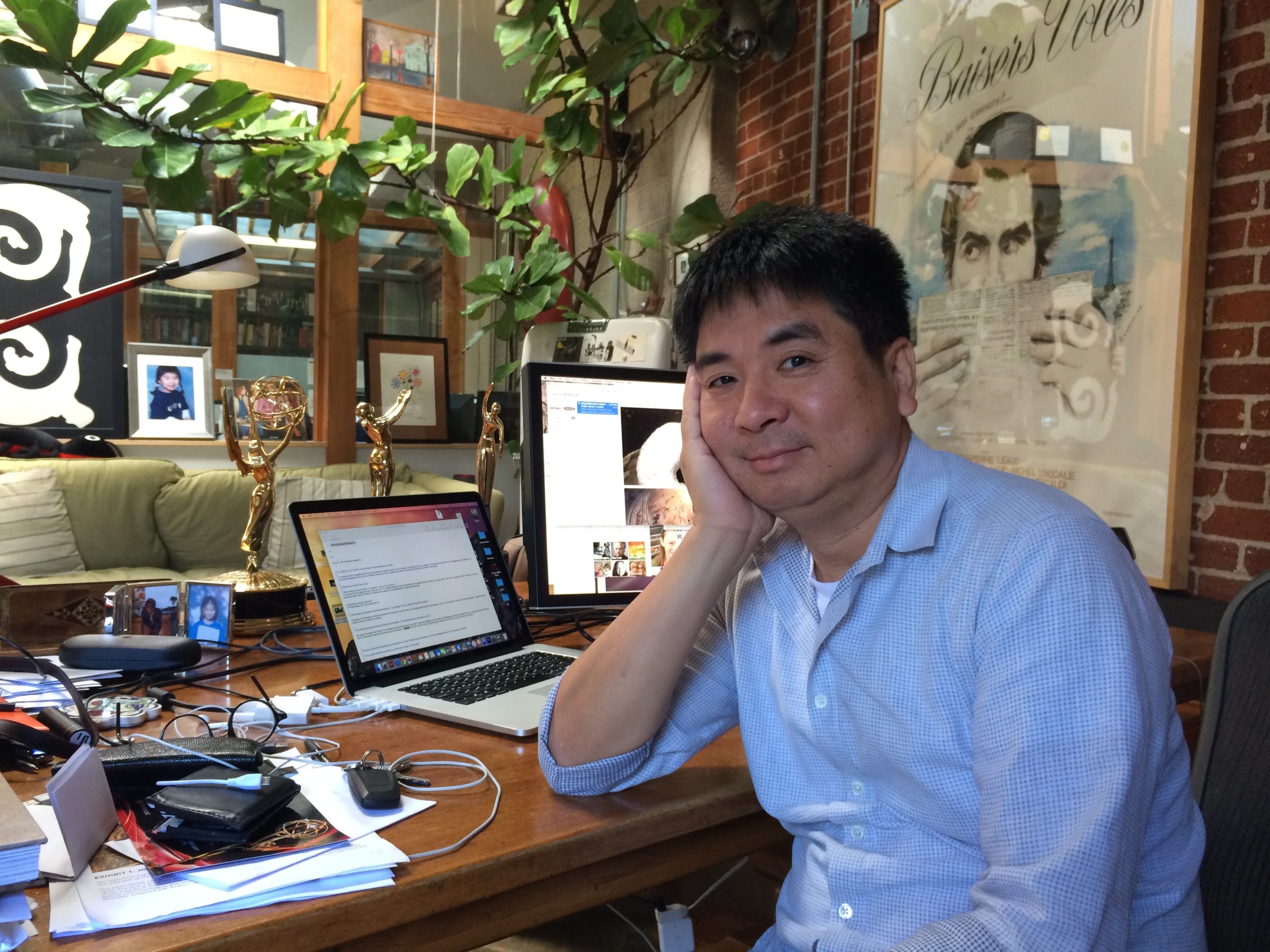
His work sets the tone for a show—often before a character has even uttered a word. Title sequence designer Garson Yu and his company, yU+co, created the snowscapes of Olive Kitteridge (for which he just earned an Emmy nomination), the busy animated hub of Silicon Valley, the blurred glimpses into The Walking Dead and the artistic sorrow outlined in The Leftovers. Yu breaks down what it means to be a story starter.
How did you get into title design?
I studied graphic design at Yale. I used to do posters and printed materials, and I decided to find another medium. I started working at R/Greenberg Associates in New York, and that’s where I learned how to design motion graphics. At that time, there weren’t many companies that did main title design, so we had the opportunity to work on a lot of great films. Later on, I started to get involved in broadcast design and title design.
How do you work with a show’s producers?
Producers are a very integral part of the design. They might not have a key understanding of what the title sequence should be, but we get guidance from them in setting the tone. They will send us a few episodes or some scripts. We normally have two to four weeks to come up with some concepts and ideas to pitch. Production will be four weeks to eight weeks, depending on the complexity of the concept. But it’s a collaborative process, and overall it is so much richer with the collaborations.
Was the business always like this?
In the old days, the post-production producers would call and give us some directions. The title designs were always an afterthought, but now they really pay attention to it. Sometimes we’ll have five different people call us. I think that people really realize the title design is an art form and a story by itself.
What makes the Olive Kitteridge sequence special?
Usually title sequences are very contemporary, like True Detective, or edgy, like American Horror Story. My work is a little less edgy. I’ve tried it in the past, but it’s really not me. I’m not edgy. A title sequence should not be so literal, and I think that Olive Kitteridge’s is very quiet and very internal. It reflects the character’s state of mind. You are sinking in, deeper and deeper.
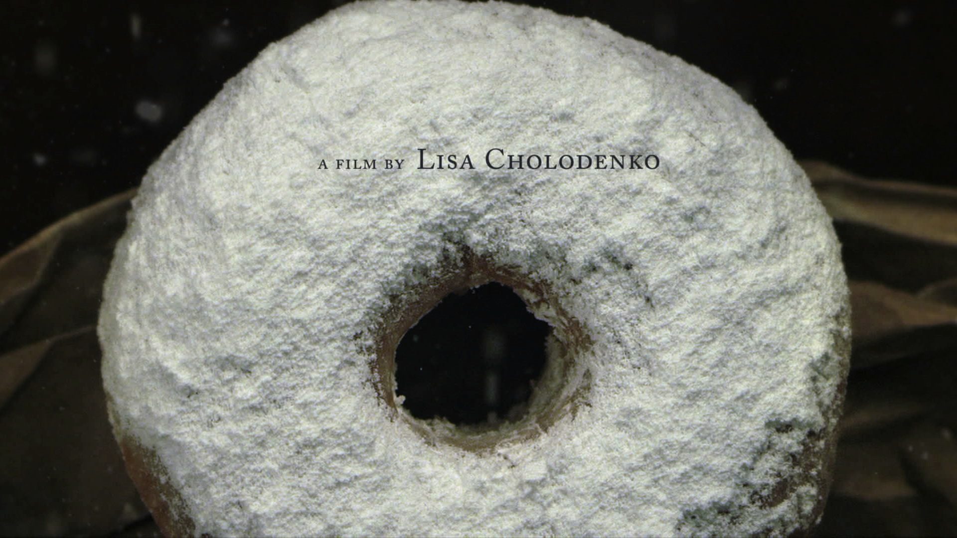
Olive Kitteridge main title sequence
What about Silicon Valley‘s sequence (which was nominated in 2014)? I noticed that you’ve been adding start-ups like Uber to it, as the show progresses.
The Silicon Valley sequence was designed so that we could have a template that was capable of expanding, which works really well with the dotcom culture because we always have new companies, and the bubble is always growing and shrinking. So, for the new seasons, we added new start-ups and we added more complexity to the sequence, and it will get much more complex. I wanted the audience to be able to stop every single moment and see something new and different.
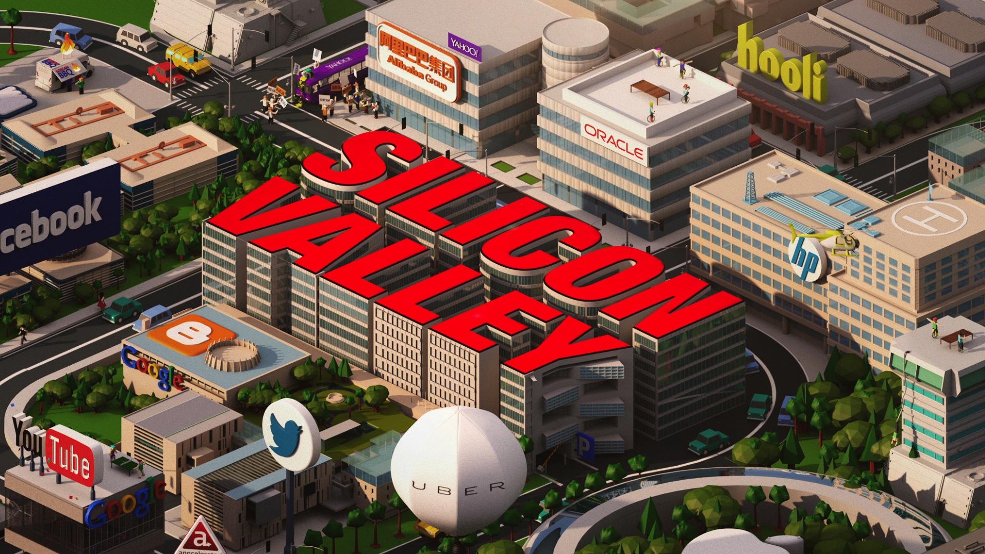
Silicon Valley main title sequence
Which sequence do you wish you’d thought of?
Mad Men. It’s not about the style, really; it’s about the metaphor. It hit the mark of the entire show. We pitched on that and didn’t get it. I thought the metaphor of things falling apart and seeing a guy falling is just one simple metaphor that I wish I had thought of. It really did hit the mark of the entire show.
Which sequence are you most proud of?
I love all my children, but I really liked Desperate Housewives. That was something that set up a new trend, using the pop-up book. I heard from some of my colleagues, who worked for another design company, that they had clients who wanted to do the same idea. The Leftovers, Silicon Valley, and Olive Kitteridge are my favorite title sequences recently. I think it’s important that we like what we do.
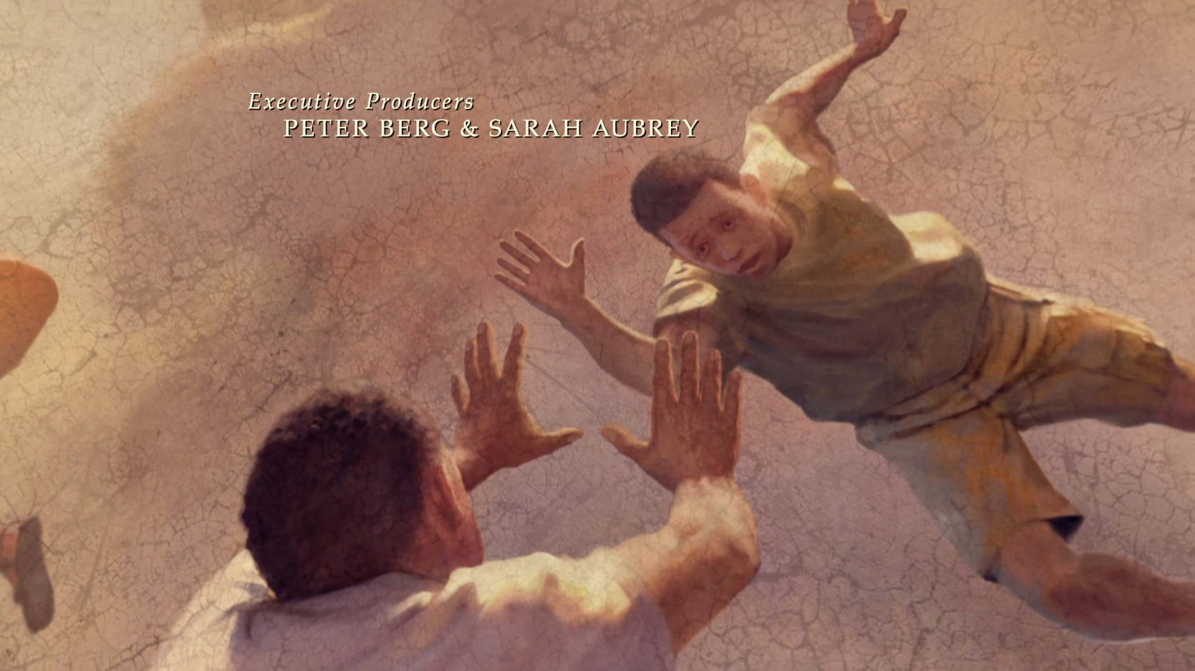
The Leftovers main title sequence